Año: 2021
Cliente: Quare
Categoría: identidad de marca, branding.
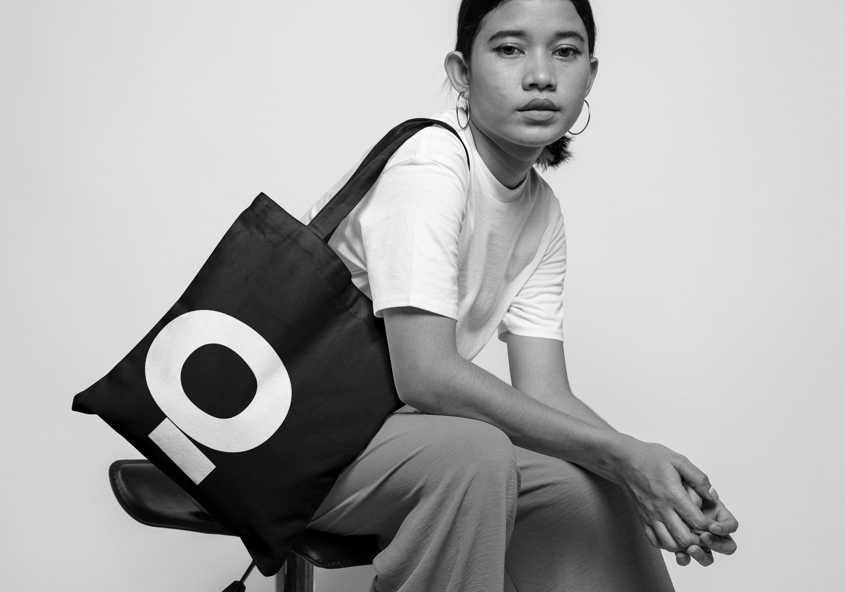
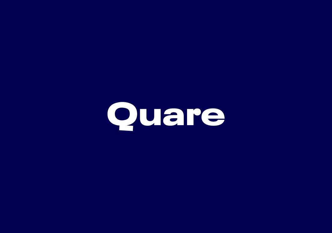
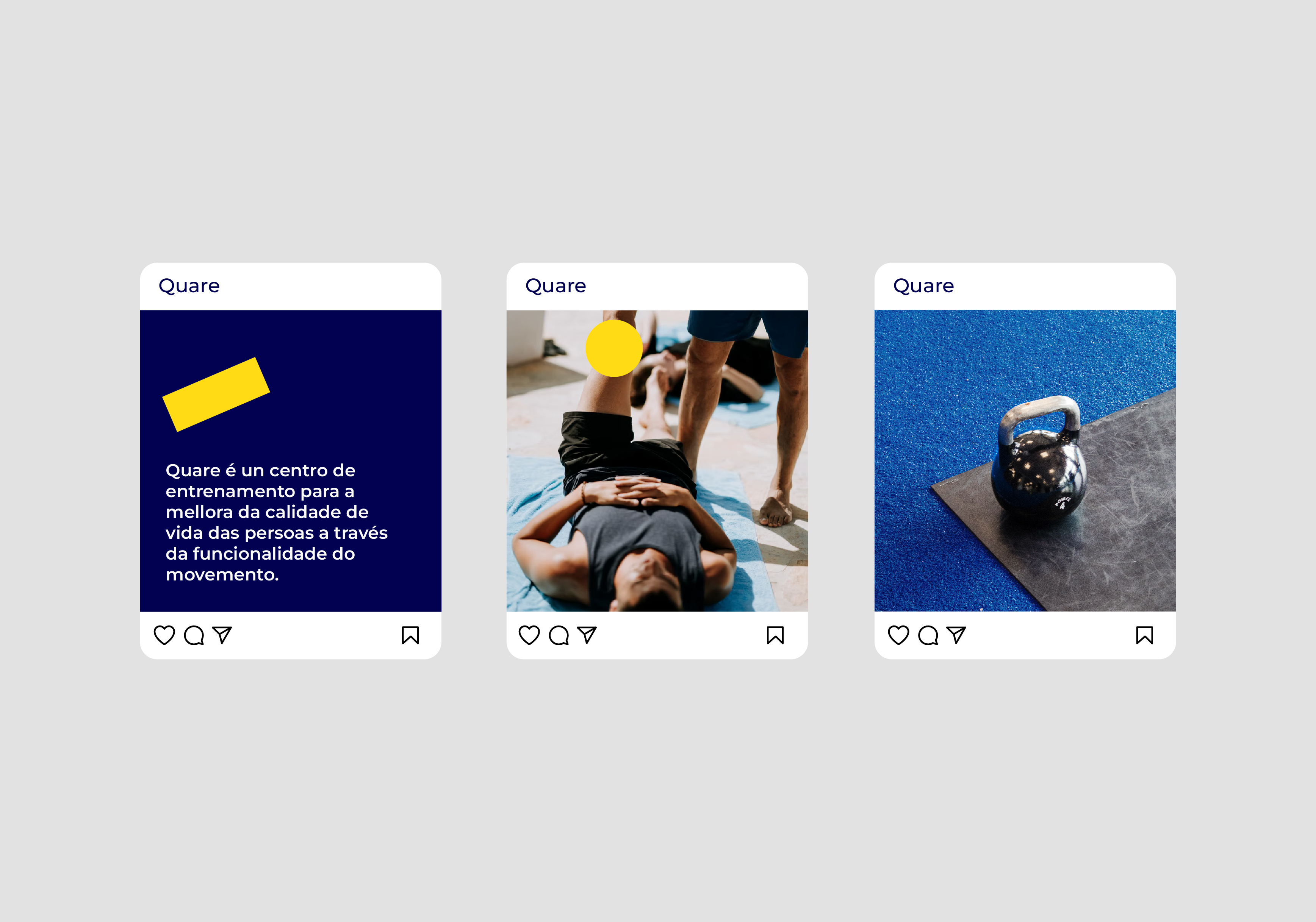
Diseño de identidad de marca y aplicaciones para Quare.
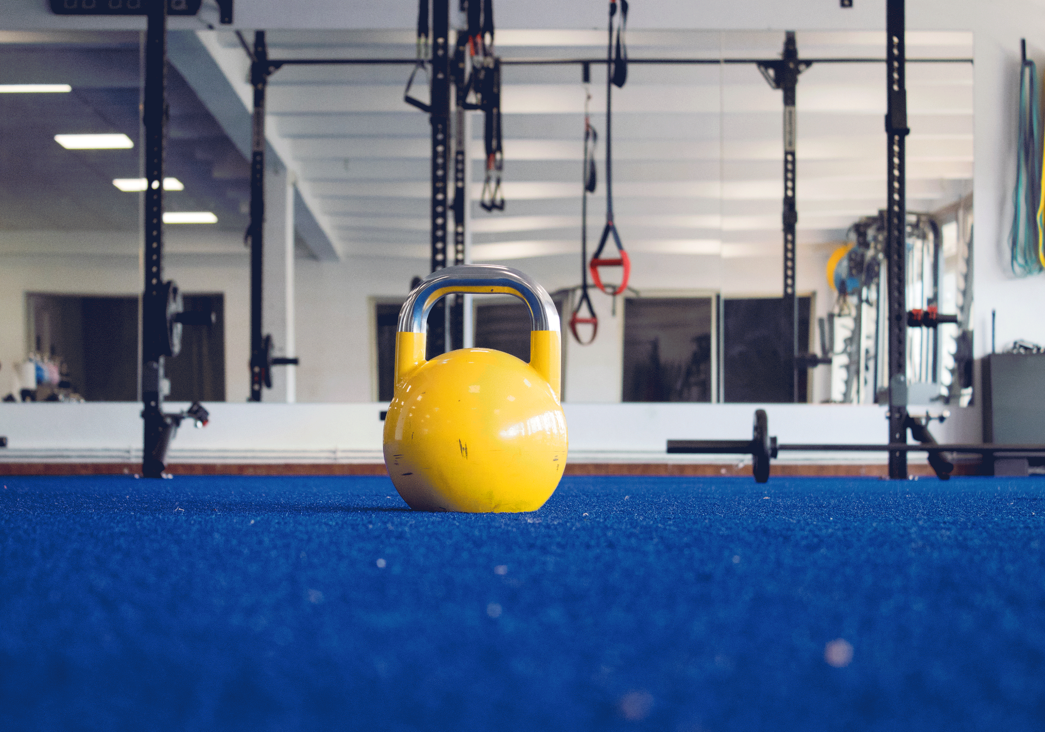
Quare es un centro de formación situado en Redondela (Pontevedra). Su objetivo es mejorar la calidad de vida de las personas
así como optimizar el rendimiento deportivo a través de la funcionalidad del movimiento.
Para este proyecto se utilizó como base el concepto de motricidad y movimiento. Quare es una decisión personal sobre el estilo de vida que queremos llevar.
www.quaresr.es
Como elementos gráficos para este proyecto elegimos la tipografía Neue Plak Wide Black
para el logo y la Montserrat para las aplicaciones. Apostamos por tres colores identificativos para
la marca: azul, amarillo y gris.
El objetivo es crear una imagen de marca acorde a las necesidades del cliente utilizando sólo los elementos esenciales.